GM Fleet Management
OVERVIEW
Problem: Commercial fleet customers relied on disconnected telematics tools to manage vehicle health, driver safety, account administration, and daily operations, contributing to a 35% decline in efficiency for customers using multiple systems. With 95% of users requesting a simpler, more intelligent solution, fragmented services and redundant workflows were limiting platform value, discoverability, and adoption.
Solution: A unified commercial fleet platform that consolidated account management, operational insights, vehicle health, and driver-safety workflows into one scalable experience—reducing application switching, improving access to critical information, and using clearer navigation, faceted search, personalization, and intelligent assistance to help customers act more efficiently.
My Role & Impact: Led the experience strategy and systems design for the new OnStar Business Solutions commercial platform, translating customer research and operational complexity into a unified information architecture, scalable interaction model, and delivery-ready design direction while aligning design, product, engineering, research, and business teams around shared priorities.
- Achieved alignment across 95% of participating teams around the consolidated platform direction.
- Stress-tested the architecture through 5–7 operational scenarios with five designers, reducing unnecessary view switching and workflow complexity.
- Established a foundation projected to reduce redundant workflows by 80% and improve operational efficiency by 50%.
- Supported an anticipated 10% increase in user penetration through improved discoverability and simplified access to essential capabilities.
- Contributed to a platform strategy projected to generate approximately $2M in annual savings.
![]()
UX PROCESS
DISCOVERY
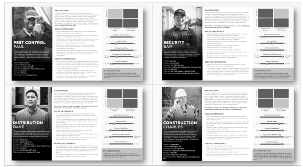
In collaboration with Lextant, Escalent, and the OnStar business strategy, I conducted research to de-risk our assumptions and uncovered two key insights:
a) Customers using multiple tools—saw a 35% drop in efficiency.
b) 95% of users requested a simple yet intelligent tool to streamline operations, vehicle health, and driver safety.
![]()
These insights validated the decision to consolidate applications, integrate key enablers into a unified solution, and define clear business goals and success metrics to drive greater value.
UX STRATEGY
The core design decision was to consolidate key capabilities into a unified solution rather than continue extending disconnected workflows across multiple applications.
This meant focusing on:
- reducing workflow switching
- improving visibility of high-value information
- simplifying access to essential tasks
- creating a structure that could scale across different user needs and future capabilities
By framing the work around customer workflows instead of product boundaries, I helped define a clearer experience strategy and stronger success measures for the business.
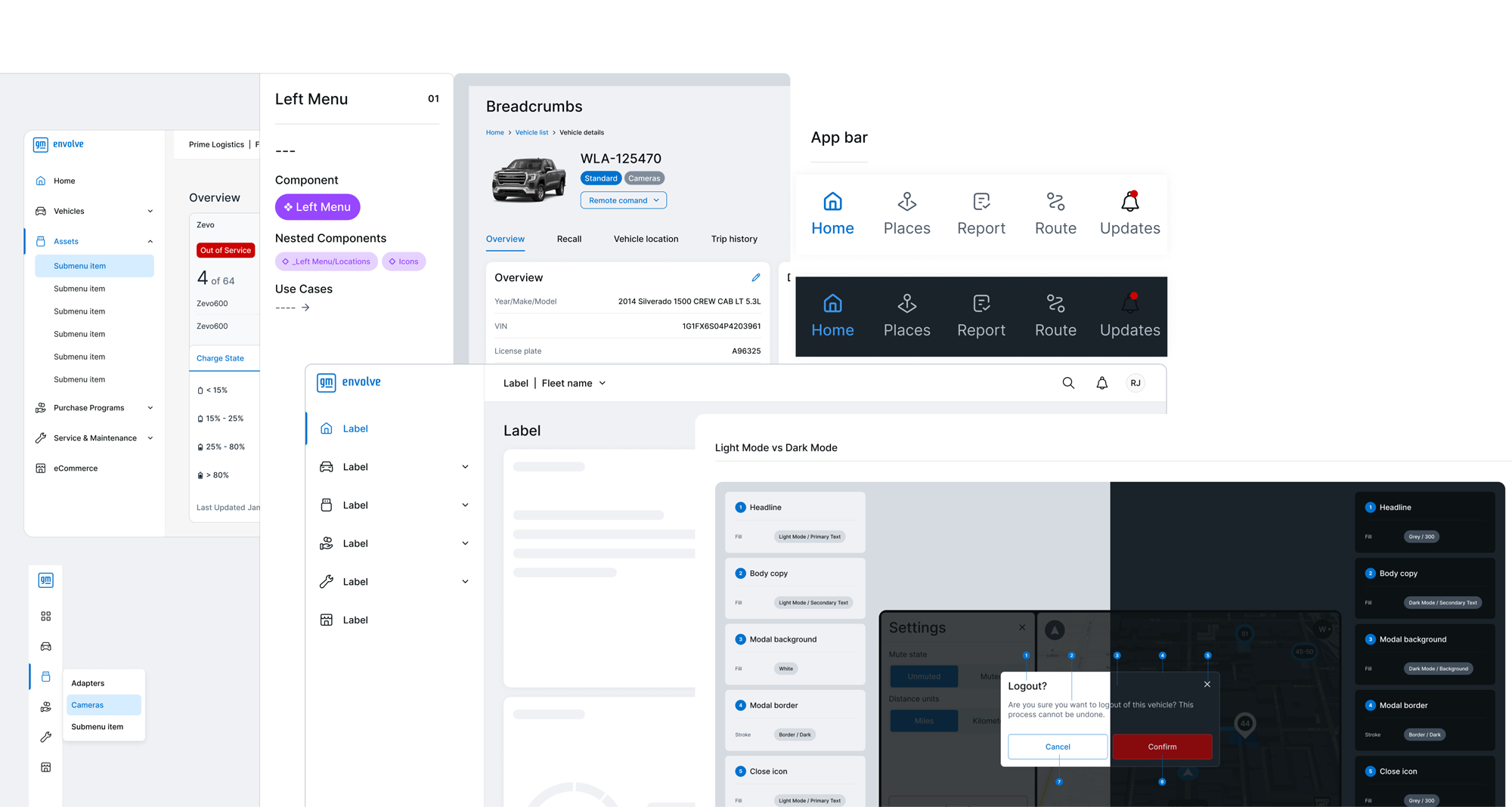
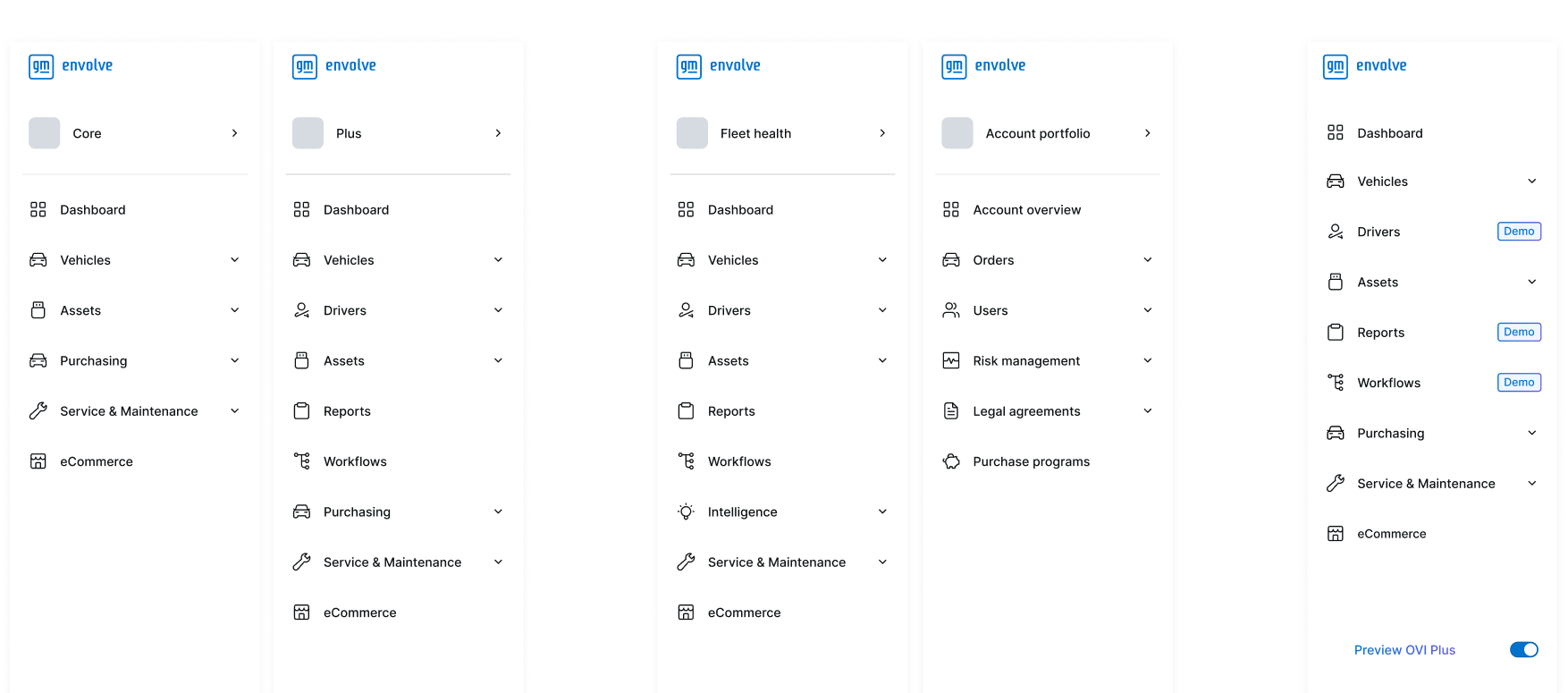
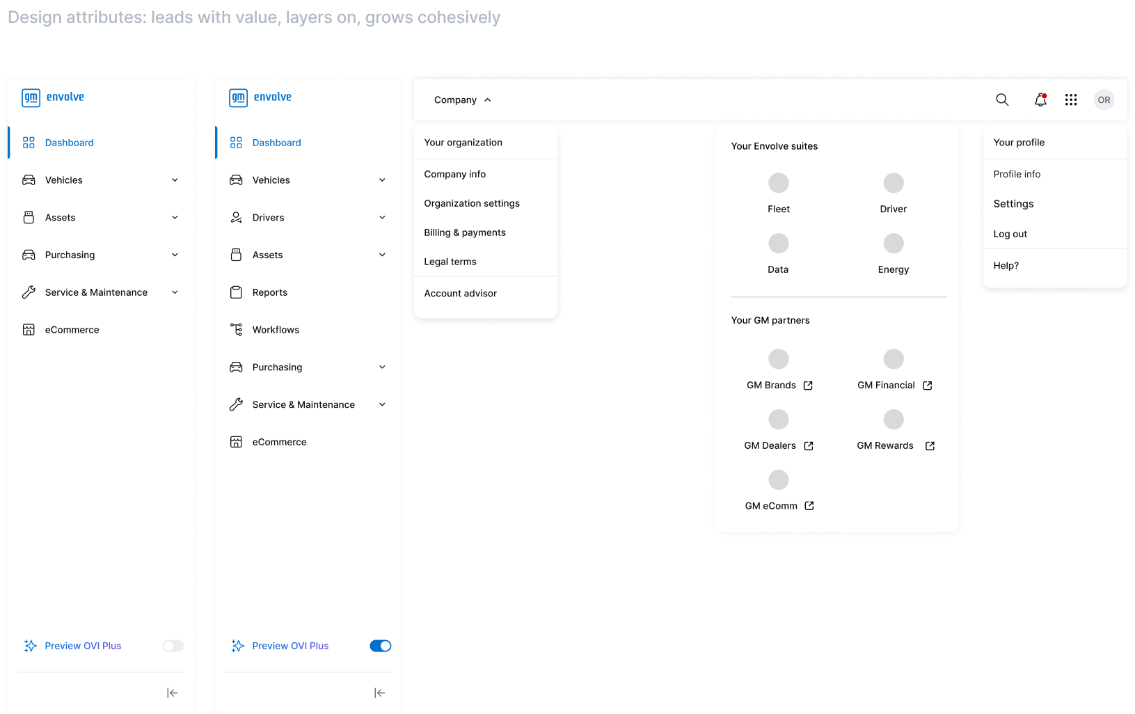
Information architecture
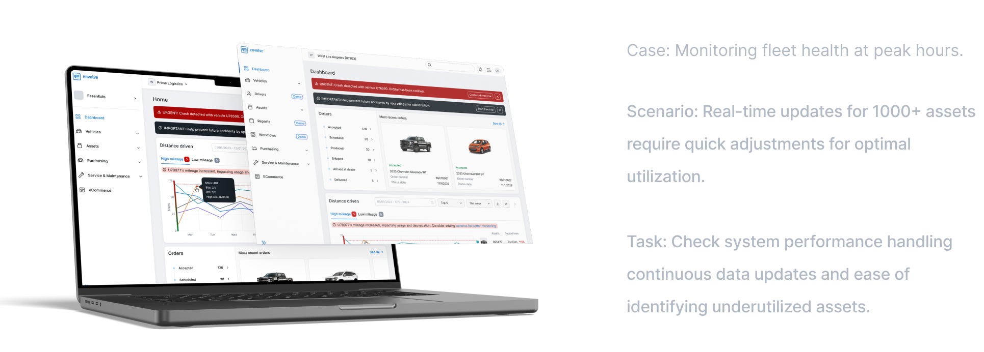
A major part of the work focused on stress-testing the information architecture and interaction model to ensure the solution could support real-world complexity without becoming harder to use.
![]()
Stress testing
![]()
![]()
After running 5 to 7 stress-testing scenarios with 5 designers, we identified opportunities to simplify the interface by reducing the need for constant view switching and removing unnecessary workflow complexity.
This led to a more streamlined structure supported by:
- improved navigation clarity
- reduced cognitive load across key tasks
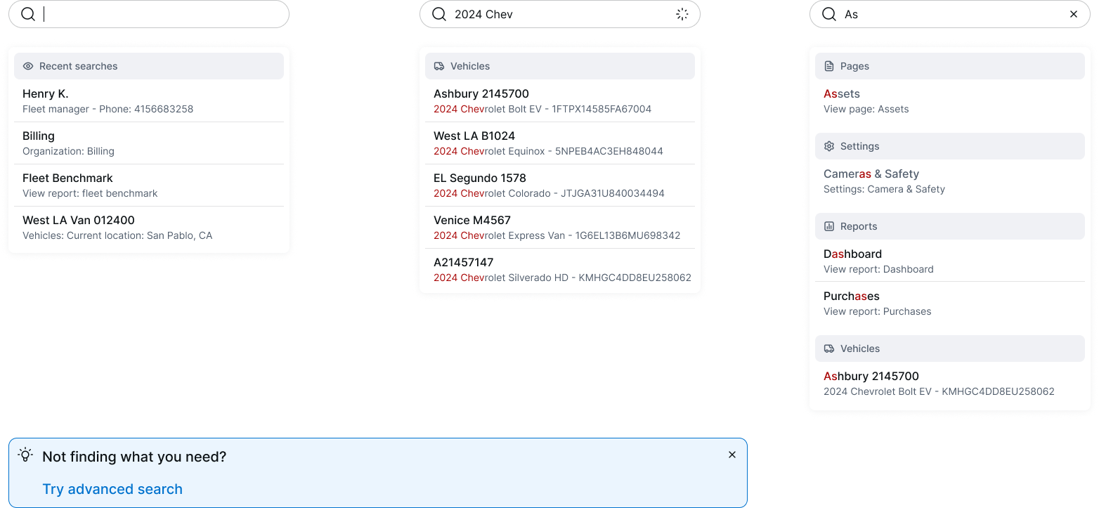
- better discoverability through filtering and faceted search
- more personalized and efficient workflows through features like auto-complete and customization
These choices were important because the goal was not just consolidation, but consolidation without overwhelming users.
![]()
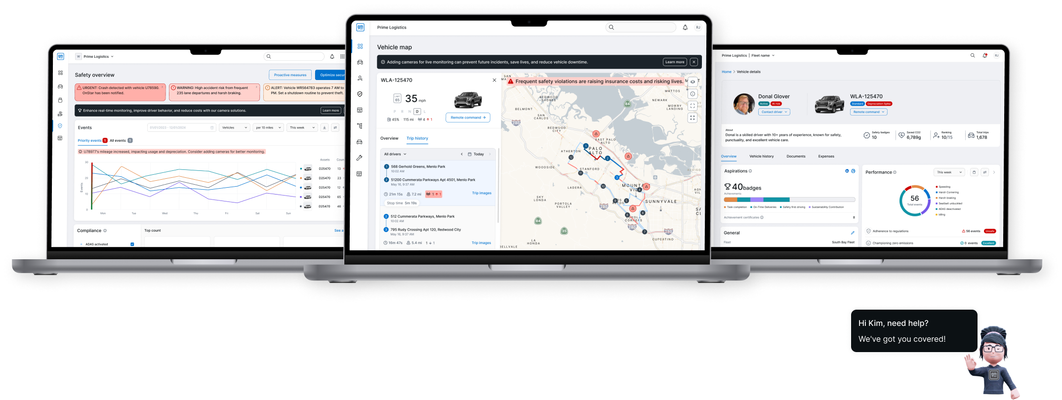
EXECUTION
Detailed design guidance, interaction patterns, and responsive behavior recommendations helped support a high-quality handoff and more consistent execution. This collaboration helped move the work from concept to delivery with greater alignment and less ambiguity across teams.
![]()
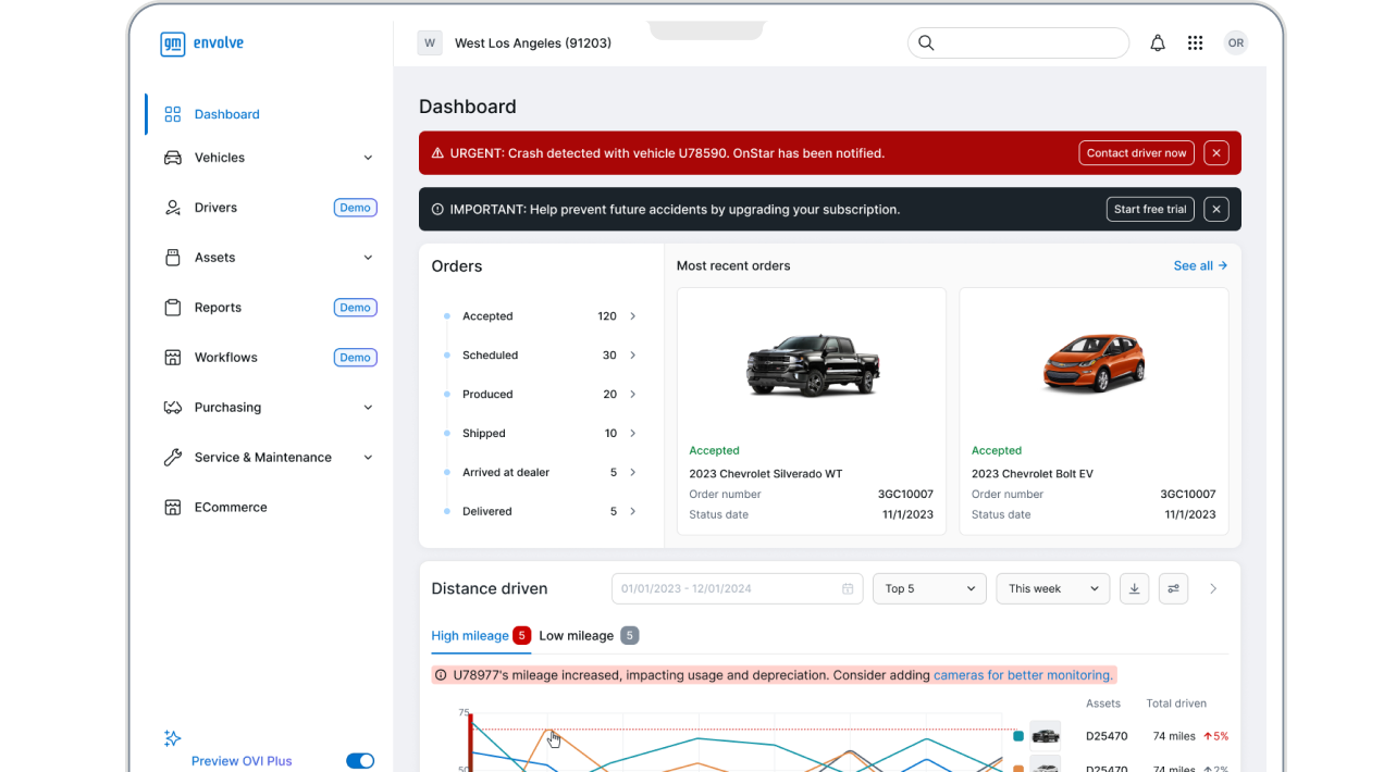
The result was a more unified commercial fleet experience that reduced fragmentation across account management, insights, and operations.
By simplifying workflows, improving discoverability, and aligning teams around a shared direction, the work created a stronger foundation for customer adoption, operational efficiency, and future platform growth.
![]()
![]()