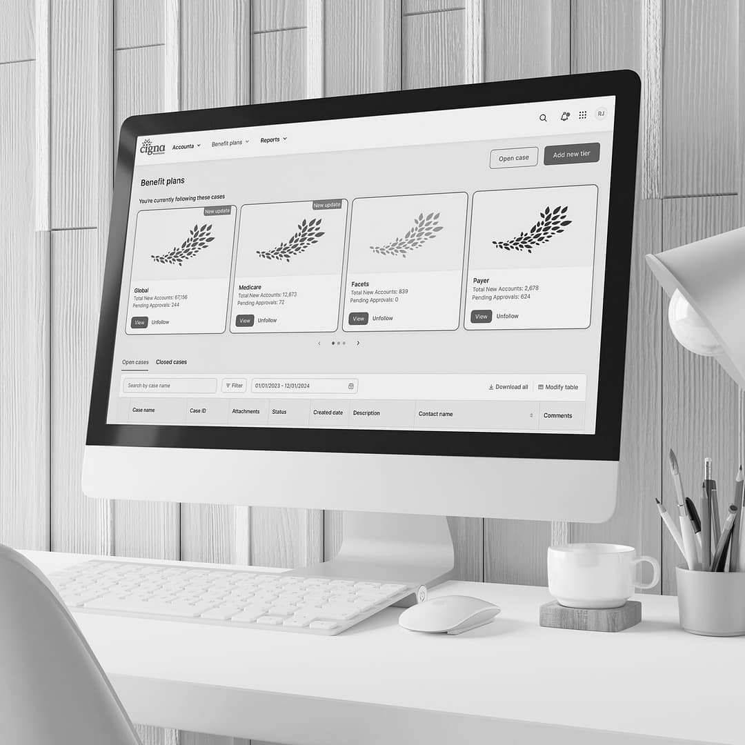
Cigna benefit orchestration
| Experience design – Cigna, 2020 – 2021
![]()
OVERVIEW
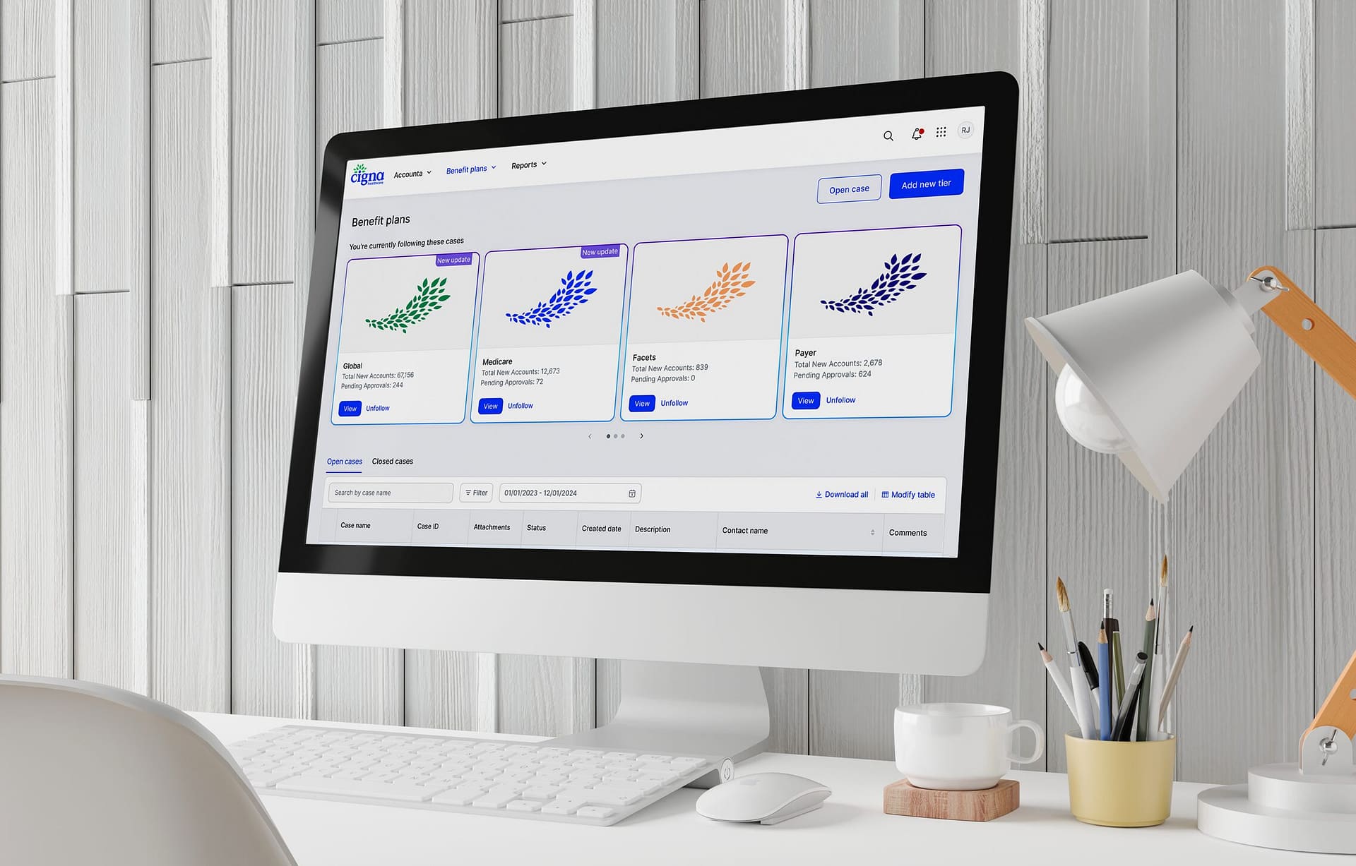
This work focused on reimagining Cigna’s enterprise client benefit pricing experience at a time when the product had become difficult to navigate, difficult to learn, and increasingly inefficient for the experts who relied on it every day.
Managing benefit plans, clinical coverage elections, and account-to-client associations required too much effort because the experience lacked a clear structure. Important features were hard to find, workflows felt disconnected, and the overall product was losing trust among users. I led the redesign from both a product and team perspective, shaping a more coherent experience while also strengthening how design was understood and practiced across the group.
The result was a more modern enterprise experience that reduced time spent searching for features, increased task completion by 50%, and created stronger conditions for onboarding, adoption, and long-term user confidence.
![]()
Challenge
The product was asking users to manage high-stakes administrative work through flows that felt cumbersome and inconsistent. Core tasks were technically possible, but the path through them was unclear. That ambiguity slowed execution, increased cognitive load, and made the system harder to trust.
What made the problem more consequential was that it extended beyond surface quality. The experience lacked a cohesive model for how complex work should be organized, surfaced, and completed. Without that foundation, even small tasks felt heavier than they should, and the product became harder to scale or improve in a meaningful way.
![]()
My Role
As a Lead, my role as a designer I was responsible for reimagining Cigna’s enterprise client benefit pricing experience while also helping strengthen the team’s design approach, collaboration model, and execution quality.
I led the effort from both a product and team perspective, focusing on simplifying complex workflows, improving discoverability of critical features, and creating a clearer experience architecture for enterprise users. At the same time, I worked to build stronger cross-functional alignment, introduce more user-centered ways of working, and create the structure needed for design to have greater influence across the product lifecycle.
The reimagined experience made coverage elections, benefit pricing, and account profile management easier to find and faster to manage. It reduced time spent searching for features, increased task completion by 50%, and created stronger conditions for onboarding, adoption, and long-term user confidence.
![]()
UX PROCESS
![]()
Discover
I started by identifying the most important user and business goals, but quickly recognized that the challenge extended beyond the product itself. Cross-functional teams had limited familiarity with design thinking and user-centered product development, which made early alignment and shared ownership especially important.
Rather than treating that as a constraint, I focused on creating the conditions for better collaboration. I identified allies, built support for a more integrated design process, and gradually involved product, engineering, and other partners more directly in the work.
This helped establish stronger participation in research, testing, and insight-sharing, while also increasing team investment in the direction of the experience.
![]()
UX strategy
A critical part of my role was establishing stronger structure across both the product and the team’s way of working.
From an experience standpoint, I focused on:
- improving information hierarchy across complex tasks and data types
- making feature access more intuitive
- creating more consistency in workflows, patterns, and page logic
- reducing ambiguity in how users moved through important decisions
From a team and process standpoint, I helped establish:
- a clearer understanding of UX design thinking and its value
- stronger connection between design activities and development workflows
- a more end-to-end view of how discovery, definition, design, testing, and handoff work together
- more repeatable collaboration practices across product, engineering, and design
- clearer documentation of user insights, rationale, and flows to support execution

![]()
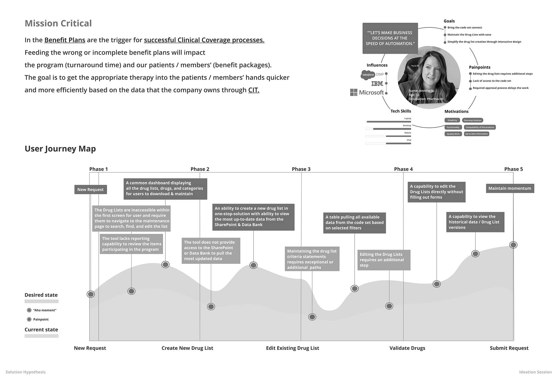
I partnered with users and subject matter experts to understand where the experience was breaking down and what people needed to perform effectively.
Using those insights, I helped shape a detailed journey view that clarified:
- user roles and responsibilities
- high-friction moments across the experience
- key touchpoints influencing confidence and efficiency
- opportunities to reduce cognitive load and improve clarity
This work gave the team a more grounded view of the problem space and helped connect UX activities directly to real user and business needs.
![]()
![]()
Define
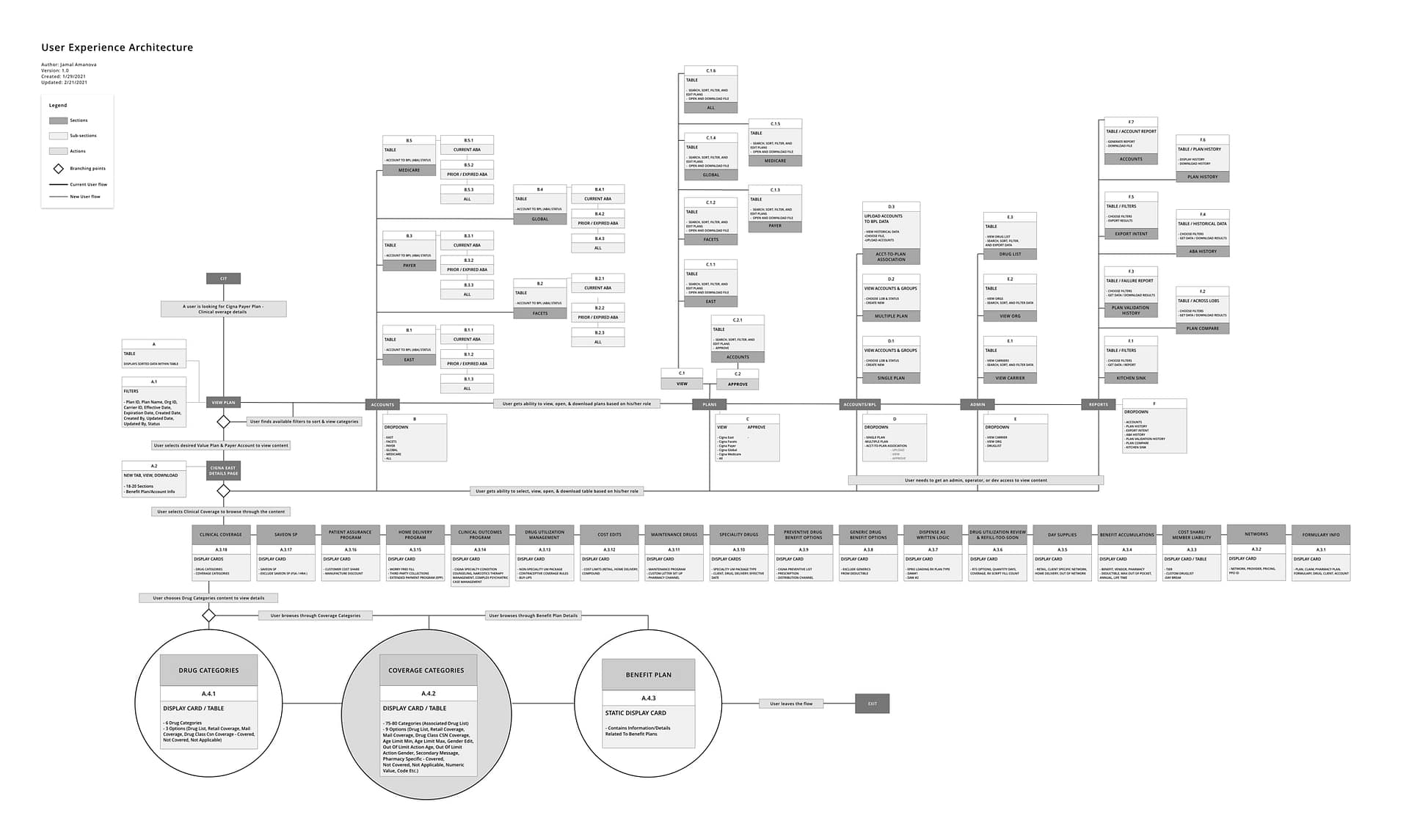
With the problem space clearer, I helped guide the team toward a more strategic and feasible direction.
This phase focused on:
- identifying the workflows with the highest user and business value
- clarifying what needed simplification first
- balancing immediate usability gains with longer-term architectural improvements
- aligning design priorities with technical and delivery realities
I also challenged the status quo when needed, ensuring the team did not default to incremental fixes where more structural change was necessary.
![]()
![]()
Design
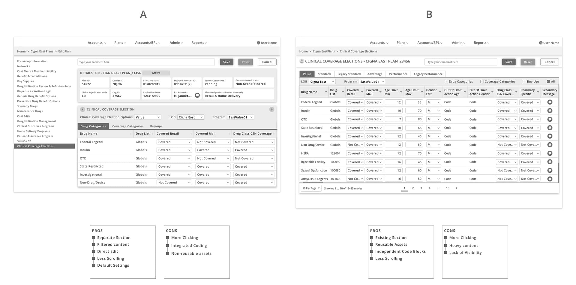
After prioritizing user needs, I guided the design effort through iterative wireframing and concept development.
The goal was not just to improve the interface, but to shape a more coherent and learnable enterprise experience. Early concepts stayed intentionally lightweight so the team could explore options, validate assumptions, and understand the relationship between UX decisions and downstream development before moving into more detailed design.
As concepts matured, I supported validation through feedback sessions and comparative testing, helping ensure the work stayed aligned to both user expectations and enterprise requirements.
![]()
Testing
Testing confirmed that the new direction was easier to understand, more efficient to navigate, and better aligned with how users managed benefit pricing and related tasks.
![]()
EXECUTION
In the final phase, I focused on helping the team translate strategy into scalable execution.
This included supporting style and interaction guidance, documenting flows and rationale, and ensuring engineering had the clarity needed to implement the work consistently. I also continued reinforcing how UX fit into the full product lifecycle so the team could better connect design decisions to development outcomes.
The result was a more modern and coherent enterprise experience that improved discoverability, simplified complex tasks, and strengthened both product quality and team maturity.
![]()
![]()
IMPACT
The reimagined experience improved task completion by 50% and reduced the time users spent searching for critical features.
It also created stronger conditions for onboarding, adoption, and long-term confidence by making complex tasks easier to find, easier to understand, and easier to complete. Beyond the interface itself, the work strengthened team alignment and brought more structure to how design decisions were made and carried forward.
